Monday, 14 December 2009


I finally added the hooks for stories to draw the audience in and make them want to buy the magazine. I used the same font as my title and main story title. I used both white and dark blue text. I decided to put the 'PLUS' in red writing as I think this automatically draws the attention of the reader.
For the title of my magazine I used the font Berlin Sans FB Demi. I had originally wanted to use Century Gothic but after seeing this font I thought it looked a lot better. I used two effects: Drop Shadow and Bevel and Emboss. This makes the title stand out against the background. I used the same font for the LEXI GAGE story tag, on this I used the Drop Shadow effect also. With this I put a smaller bit of text 'Exclusive interview only in DELERIUM' this gives an insight into the story. The font on this is ITC Franklin Gothic. At the top of the page i have out the issue number, the price and the date. I have also included FREE TRANSFUSION CD INSIDE which draws the reader in and makes them want to buy the magazine even more. The FREE is in dark blue which links with the colour of my other text.


Once I had decided on my background colour I copied and pasted my image onto the cover. I had originally planned on using blue as my background colour however I thought that it didn't really fit in with the colour scheme of my magazine so I changed to using black. The title DELERIUM has connotations of something euphoric and mysterious so this background works well with the title.

Monday, 7 December 2009


I looked at these magazine covers because I wanted my magazine to be similar to MixMag. The genre of music these magazines look at is similar to the genre of music my magazine DELERIUM is about.

http://www.mixmag.net/

Monday, 23 November 2009


Once I had decided to use this picture I used the eraser tool on photoshop to cut it out. The head phones she is wearing represent the type of music my magazine is about.


Monday, 16 November 2009


I decided to use this photograph because the model looks fun and intriguing. Instead of looking straight at the camera I decided to have her looking slightly away. To me this picture has connotations of mischief which my magazine also seems to be about.

This picture doesn't engage the audience at all because the model is looking completely away from the camera. To me this picture seems boring and uninteresting. That is why I decided not to use it.
This is one of the pictures I took to use on my front cover but I decided not to use it because my model looks too serious. Also I knew this picture had far too much space above the head, and makes the background look much bigger than the model and I think this makes the picture look weak.

Wednesday, 11 November 2009


  • I looked at all of these different fonts. I asked 30 people to say what they thought the best fonts were. The three most popular were:
  • Arial Narrow
  • Century Gothic
  • Alba Super
  • I decided to use Century Gothic because it is simple and easy to read

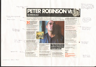
This article has a bold title which is typical for a magazine article. It also has a some background information just before the story starts. all of the text is justified. There are only a few types of font in this piece. There are also some smaller pictures which is also typical of an article. The celebrity in the main picture is part of the invitational band, lips slightly parted, emphasis on the eyes only a hint of a smile

Wednesday, 4 November 2009

Analysis


This is the contents page of Q Magazine. It follows the typical conventions of contents pages. As usual the headings are bold and easy to understand. They are eye catching in order to make the reader intrigued. It has pictures with small captions about the story, again to make the reader want to read on. It uses typically about 3 fonts and the colour scheme is red, black and white which is generally the colours used on the cover of Q Magazine. The figures in the pictures are icons in the music industry. They are role models to any male who reads the magazine becasue they are stereotypically 'cool', this means most men aspire to be like them. One of the main headings 'Oasis Special' is used to draw the audience in. Oasis is a well known and liked band, this gets the attention of any Oasis fans, they will want to read the story about them. The text on the left hand side is justified which is also a typical convention of a magazine.

Wednesday, 21 October 2009


This is the contents page for Kerrang Music Magazine. It follows the typical conventions of a contents page. It has justified text on the right hand side which shows what is in the magazine. The headings are in bold to draw the attention of the reader. The colour scheme is black, white and yellow. It also uses pictures and a small insights into the story as teasers to make the reader want to read on. The people used in the pictures are all well known so any of their fans will want to read the stories about them.
Monday, 19 October 2009


This is NME Music Magazine. It follows the typical conventions of a music magazine. Usually the title would be behind the model because it is a well known magazine but on this issue it is not. It typically has a bar code, date, and a price. The model on this magazine is an icon in the music industry which makes the reader want to be her. The medium close-up photograph is slightly to the right. Although it is a woman on the cover this magazine it has connotations of both men and women due to the colour scheme which uses only two colours. The text is justified. The big title introduces the main article within the magazine. The hooks for stories are catchy to make the reader want to buy it. I think the target audience for this magazine is 16-30.

This is Q Music Magazine. It follows the typical conventions of a music magazine. It is a well known magazine so the title is behind the model. It typically has a bar code, date, and a price. The model on the cover is Madonna who is a well known icon in the music industry. The medium close-up is slightly to the right which is unusual for a music magazine because they are usually centred. Marjorie Ferguson identified four types of facial expression in the cover photos of British women's magazines. I would place Madonna in the invitational category because she has emphasis on the eyes, with only a hint of a smile. This also links with Naomi Wolf's theory that erotic images of women are used to sell magazines to women because they aspire to be as glamorous as the model on the cover. Although it is a woman used on the cover this magazine has connotations of a male magazine due to the colours. The text on the left and right is justified. The big title which shows the main article in the magazine however is centred. The colour scheme is red and white which fits with the colour of the magazines logo. This magazine has three kinds of font. The hooks for stories are used to engage people in order to make them buy it. For example if you don't like Madonna there are other people in the magazine such as Adele, Duffy, Russel Brand and Little Britain etc. The target audience for this magazine I think is 16-30 because it is too complex for a younger person but it also modern.

Wednesday, 14 October 2009

The results of my survey

I found that my target audience were looking for

  • Hard House
  • Celeb interviews
  • Up to £3.00
  • A female model
  • Both dark and bright colours
  • To be sold in HMV


Wednesday, 7 October 2009

Questionnaire

Questionnaire


1.What type of music magazine do you refer?

Pop
Rock
Rap
R n b
Classic
Hip hop
Hard house

2.What type of features would you like in the music magazine?

Celebrity interviews
True stories
Other ____________________________


3.Which would your prefer on the front cover?

Girl
Boy
Band


4.What colour would you like best?

Dark colours
Bright colours
Both


5.What is the most money you would pay for a music magazine?

£1.00
£2.00
£3.00
Other


6.Would you prefer?

A weekly magazine
Or monthly magazine


7.What kind of shop would you expect this magazine to be sold at?
___________________________________________________________

Wednesday, 30 September 2009


This is my finished contents page.

I used the same colour scheme on my contents page as I did on my cover. I used pictures relevant to my stories.

My contents title uses the colour scheme from the front page. I have used two colours which contrast each other making the title stand out. I purposefully put the 'o' in yellow as I found that this was used in a few magazines.

Wednesday, 23 September 2009


My name is Lauren Cole and I am studying Media at Heworth Grange 6th form. I had to design a cover and contents page of a school magazine. This is my finished cover.


First I took pictures of a pupil and cut him out using photoshop. I put the picture onto a background and to the right. Then I chose a Heworth Grange logo to put into the right hand corner. I chose a bold font for my title 'HEWORTH TIMES' and then i added a shadow to make it stand out. I used the same colours for all text: Blue, yellow and white. I used a young model, this represents the main story ' Heworth Grange Welcomes Year Sevens'. I also used an inset picture to make the magazine more appealing.